The “Uncanny Valley” Curve
How creepy robots relate to skeuomorphism and UX
| 3 min readThe Uncanny Valley is the idea that there’s a curve related to a human-like object’s level of realism and how acceptable we perceive it to be. It’s a phenomenon observed everywhere from robotics to animation and dolls.
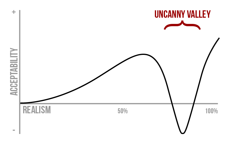
As realism increases, so does acceptability—until you hit the valley where realism is almost-but-not-quite perfect, and acceptability plummets.
If something is somewhat realistic but stylized (like a stuffed animal), we’re going to like it. The more realistic it is, the more we like it—to a certain point. A cute doll or human-like robot might bring us joy; however, once we cross a critical point in realism, our opinion of it plummets into a valley. Think about early “realistic” video games or CGI characters in movies (The Polar Express, perhaps) where the characters just feel… off. It’s possible to get out of that valley, but only if the realism is cranked up enough to be indistinguishable from reality.
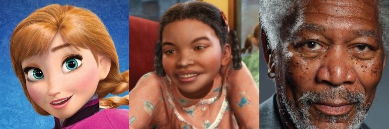
Anna from Frozen, Hero Girl (Holly) from The Polar Express, and a drawing of Morgan Freeman
For example, which of the images above seems off, or “uncanny”? The animated and slightly cartoonish Anna from Frozen, the realistic Hero Girl (Holly) from The Polar Express, or the hyperrealistic painting of Morgan Freeman?
What About UX?
The original concept of the Uncanny Valley is explicitly related to human likeness; however, what I particularly enjoy about this curve is that it can be applied to more than just robotics or animation. For example, in user interface design, skeuomorphism can be an effective tool. Adding some amount of realism aids familiarity or hints towards function: light and shadow can communicate pressability, texture can draw parallels to similarly-operated real life objects, and sounds can remind us of analog equivalents to digital actions.
But add too much real-world detail, and you risk plummeting into the realm of discomfort. A visually-detailed calendar that looks just like real paper but scrolls like a web page feels off. It may be possible to push past the valley with hyper-realism; however that’s much more time-consuming and greatly limits your possible interactions.
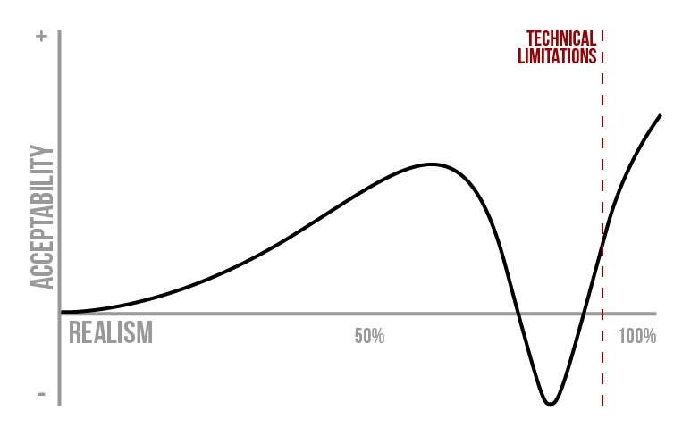
Technical limitations cap the level of realism we can achieve.
In addition, striving to achieve parity with real-life objects will always be difficult: there’s only so much you can do with a mouse or touch and a two-dimensional display. These limitations effectively cap our horizontal “realism” axis. To keep the user’s level of acceptability or enjoyment high, we must choose an appropriate level of realism. This may be part of the reason behind the trend away from skeuomorphism and toward flatter, simpler interfaces over the past decade.
In the end, the Uncanny Valley is an interesting concept to keep in mind when modeling and designing products. Its curve can be applied in several ways, from animated graphics to art, user interfaces, and beyond. Remember this the next time something semi-realistic just seems off; try pulling it back or pushing it forward out of the Uncanny Valley.
An early version of this post was authored by me in 2014 for Visual Logic. It has since been updated and largely rewritten here.