GNOME UX Hackfest 2017
Designing the future of GNOME Shell
| 12 min readI just got back from a week-long design hackfest in London focused on GNOME Shell and related components. It was a fantastic week with friends from GNOME, Red Hat, Endless, System76, and elementary working together to help make GNOME even better.
In the end we generated a lot of designs that will need to be refined, thought through more, and tested before implementation. But I’m confident the issues we raised and solutions we arrived at will positively affect GNOME Shell in the future. I look forward to the designs getting better hashed out and sharing them as soon as we can!
Photos by Jakub Steiner unless otherwise noted.
Attendees
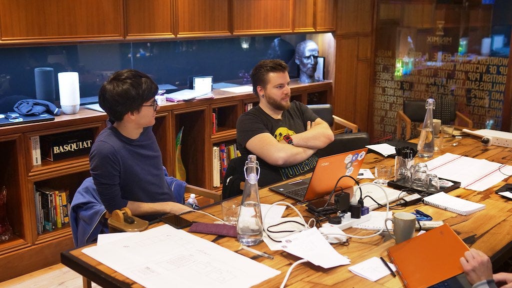
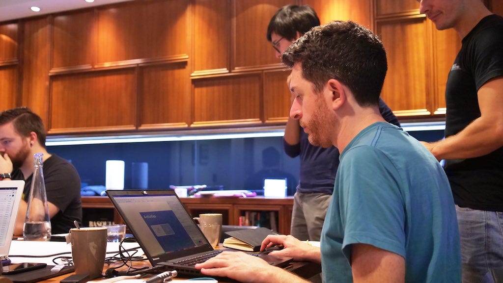
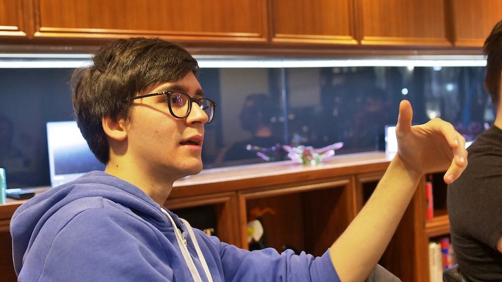
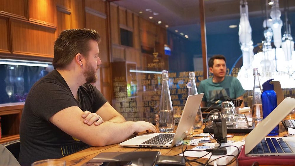
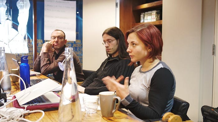
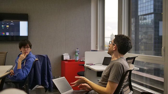
I was joined in London by Cosimo Cecchi, Mario Sanchez, Robin Tafel, Allan Day, Florian Müllner, Jakub Steiner, and Tobias Bernard.
Cosimo, Mario, and Robin are from Endless; Allan, Florian, and Jakub are from Red Hat; and Tobias is a student at TU Berlin. I attended on behalf of System76, but also brought my experience and knowledge from elementary.
We were all there, however, as GNOME community contributors and designers to work together on the future of GNOME Shell.
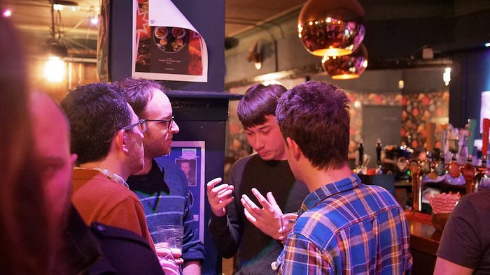
Tuesday, Nov 14
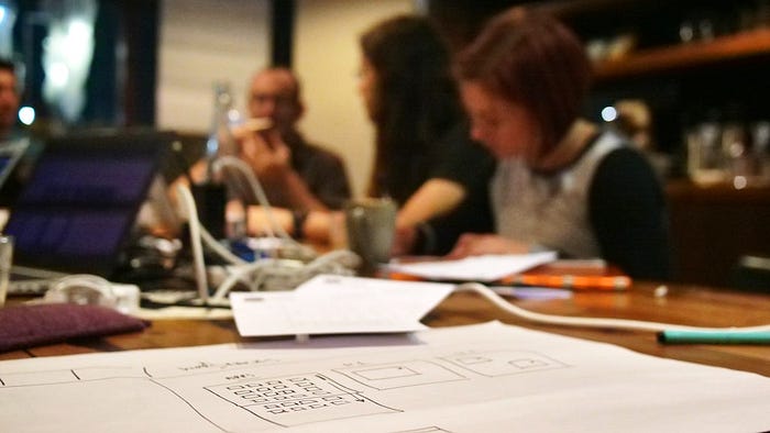
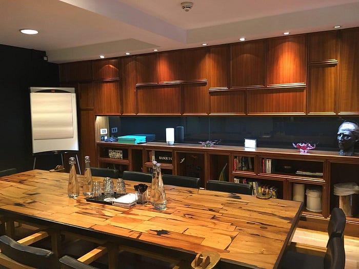
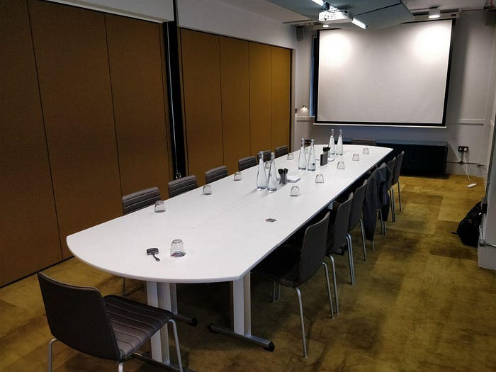
Tuesday morning we headed to the first room Endless booked at a hotel and it was super fancy. Lots of wood textures, interesting glass and stone artwork, and nice ambient lighting.
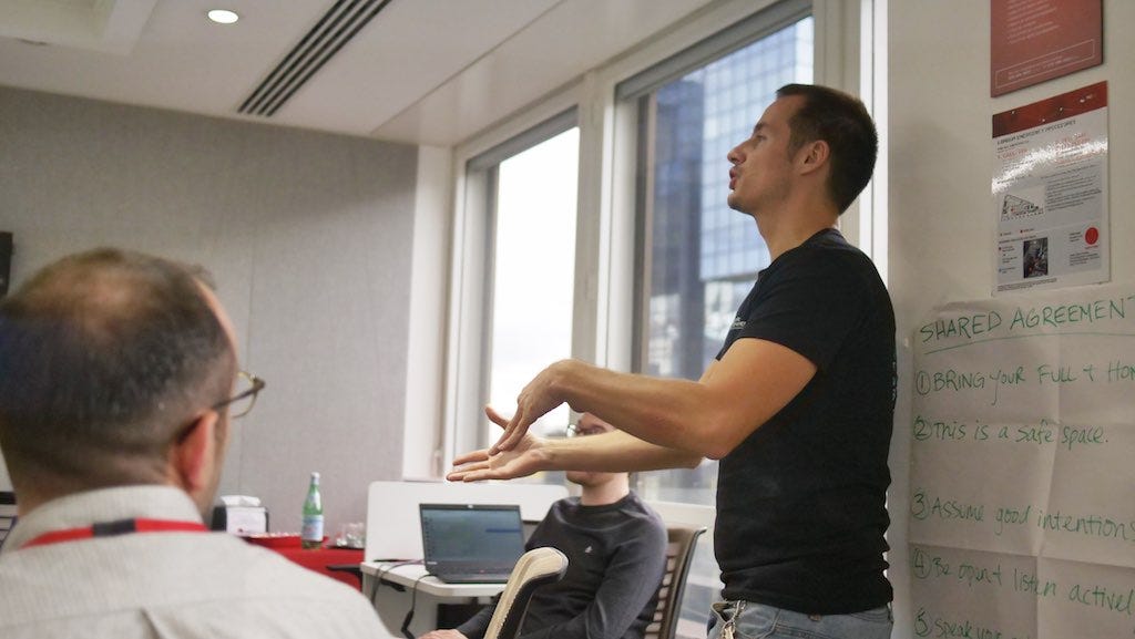
Shared Agreements
First, Robin ran through the Shared Agreements that Endless uses at events to help create a welcoming space and arrive at an mutual understanding from participants:
- Bring your full, honest self
- This is a safe space
- Assume good intentions from each other
- Be open, listen actively
- Speak your mind & heart
We all agreed to operate under these guidelines, wrote them on a large piece of paper, and posted it at each venue. I really liked this opener to ensure we’re all working together and getting the most out of the event!
Agenda

Next, we hammered out our agenda for the week, which you can check out on the hackfest wiki page. In summary, we decided to focus on three main areas for the four-day event:
- Activities Overview (2 days)
- First-Run Overlay/Tutorial (1 day)
- Login/Lock Screen (1 day)
We also decided to fit some of the other items in from the list in between if we were stuck, burnt out, or just had extra time. With the agenda decided, we dove straight into the Activites Overview.
Activities Overview
One of the first points that came up is whether people think in a more app- or window-centric way, or if that depends on the context. We also questioned the effectiveness of a big grid of alphabetic apps as the main way to see apps, and talked through potential user-customation ideas like being able to craft your own space for work and using drag-and-drop and folders to let users map things to their own mental model. We also talked about not making the default case be the overwhelming wall of apps, and ensuring a spatial model with both the pagination and how different views are connected to one another.
The first day of discussion was largely high-level and unconstrained. It ventured, at times, into tiling window managers, window switching, larger OS-wide spatial models, and “using the Z-axis.” We eventually did spend some time generating a lot of sketches and mockups of potential ideas, and Allan shared an idea he had been working on. We kind of settled into two main areas we needed to tackle: how to get into this “app picker” view, and how this app picker view would operate.
We had less consensus on how to get into it, but had started arriving on a few shared concepts with how it would operate:
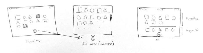
- Provide a “favorites” area that is the default view with user-manipulable icons and folders
- Have a sort of “app basement” (thanks for that term, Robin!) where all apps live and can be brought out to the favorites area
- Have a “suggested” area that would surface frequent/recent apps plus recently-installed apps to proactively prevent users from having to dive down into the basement
These concepts would help make the app picker more immediately useful to users than a paged list of everything on their system, and would help make folders actually behave how users seem to expect to based on their experiences with mobile OSes.
Other Concepts
During the exploration and generation of ideas, a few otherwise uncategorized ideas were brought up. These aren’t necessarily things that will happen, but stood out to me as interesting concepts.
One was using app icons to badge windows and workspaces in the Activities Overview; this is something we do in elementary OS and can be a boon to glanceable recognition of tasks. Another idea was revamping the Super + Tab window switcher to basically utilize the existing window spread as its UI.
These ideas weren’t fleshed out in detail, but I think they would be interesting areas to explore. Badging windows and workspaces, for example, could be a relatively small change that greatly increases the usefulness of the overview.
Wednesday, Nov 15
The space Wednesday was larger if slightly less inspiring than the venue Tuesday. We spread out and got to work on refining our ideas. Thanks again to Endless for booking this space!
App Picker
First, we regrouped around the app picker view itself. We found we were generally in consensus on what should be there, but still had questions around how exactly it should look and work. We also started generating ideas for how to get to it: Spatially on the same layer off to the left of the window spread? Behind a button that expands into the picker? From a sort of Dash that slides over on top of the existing view?
Getting Spatial
Something Tobias brought to the hackfest was the constant push to think spatially — that is, organizing interface elements into a sort of virtual physical space, keeping animations and locations of items consistent within the rules of that model.
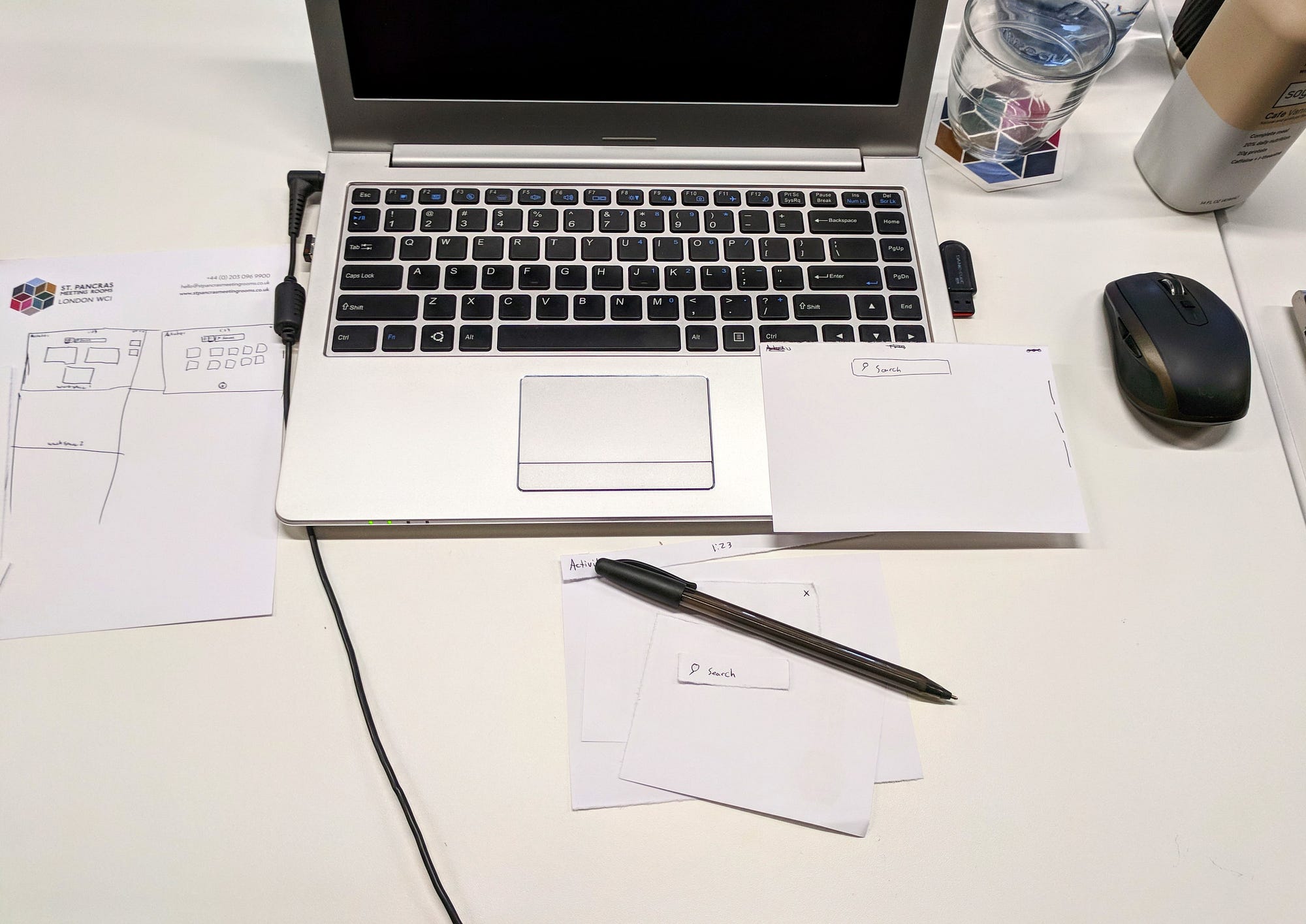

We seemed to arrive at a consensus that workspaces should continue to operate vertically and live to the right of the window spread, meaning for balance reasons the app picker should probably live to the left. This negated some of the more radical ideas like having it slide up on a sheet from the bottom (because it would be very unbalanced). Apps living to the left also keeps the general mouse travel from existing versions of GNOME Shell, meaning it would be an easier transition for existing users.
We ended the day wanting to sleep on the ideas we’d had and to give some of the designers opportunities to mock their ideas up in a higher fidelity.
Thursday, Nov 16
Activities Overview Wrap Up
Thursday we met at the Red Hat offices to wrap up our work on the Activities Overview. We shared some higher fidelity mockups and basically arrived at a consensus of the way forward. I don’t want (nor do I have the authority) to announce anything official, but my feeling was that several of the ideas we brought up earlier would need to be fleshed out and tested a bit more, then GNOME will need to decide when to implement them. It won’t likely be in the next cycle, but our work hopefully provides the foundational design work and a path forward.
First-Run Overlay
Next, we dove into the First-Run Overlay. We started with Robin showing us what Endless plans to ship in Endless OS, including the design process and thinking that went into it. Endless OS isn’t vanilla GNOME, but many of the same concepts could be adapted for GNOME itself.
I brought up my reservations with first-run tutorial patterns, but I think if implemented very basically (with only a couple of screens), it could work. Ideally it would also be implemented per-session, meaning that downstreams like Endless OS, Pop!_OS, and Ubuntu could choose to implement it and extend it or pare it back to match their experiences if they so choose.
We agreed that there are really five different components to the idea of user education and help as far as a GNOME-based OS is concerned:
-
Help Guide (which is launched on first login in GNOME today),
-
First-Run Overlay (like what Endless wants to implement),
-
A sort of feature gallery in Initial Setup to show some features and how to access them,
-
On-demand videos or tutorials that apps or the shell could call over some API (eg. in-context “help” actions that pull up a help UI focused on that feature), and
-
Progressive disclosure/education through something like tooltips
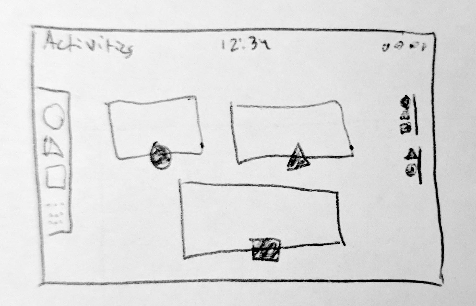
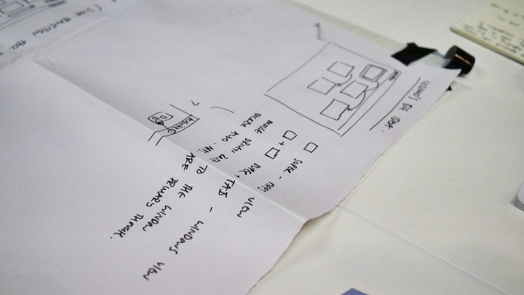
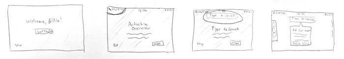
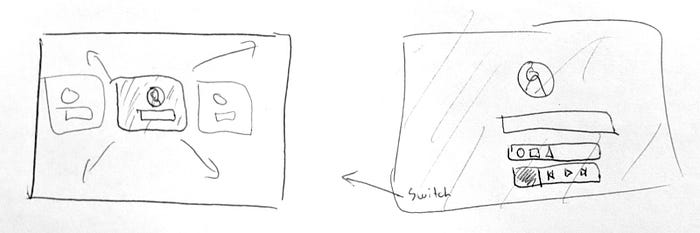
None of these are mutually exclusive, and each one could be worked on. We spent a small amount of time working on some designs for a first-run overlay, but the tricky part there is more implementation than design.
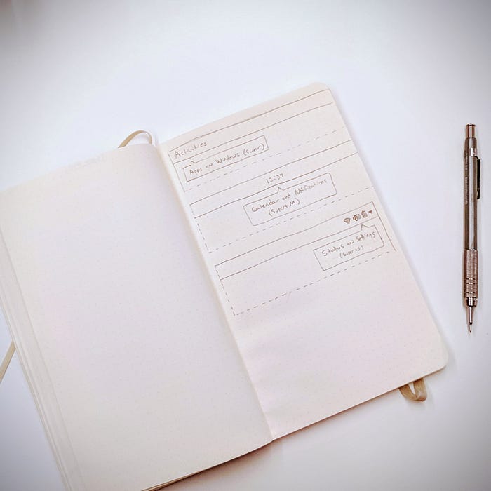
I also plan to file issues for progressive disclosure/user education through context like in my sketch above.
Starting on Login/Lock Screen
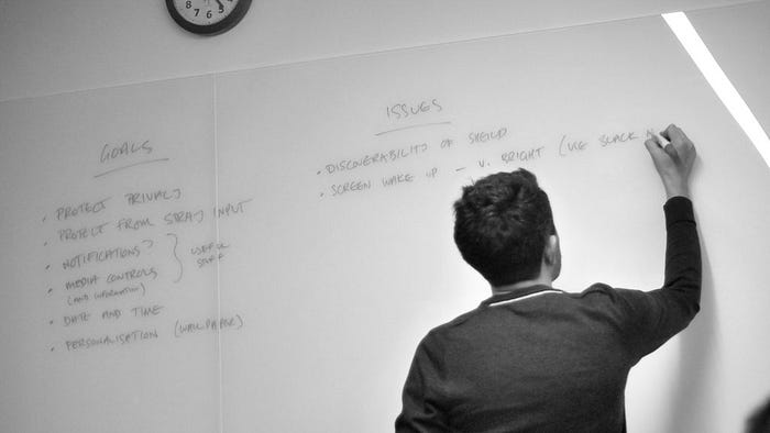
In the afternoon, we moved on to start discussing the login/lock screen. Allan started by writing up the goals of the lock screen, along with the issues that have cropped up with it since its release and the constraints that it has to operate within. The idea was to guide the discussion and design process by solving the issues while still addressing the original goals.
We ended the day after a bit of discussion, and rough sketches of how space could be better utilized, but nothing concrete.
Friday, Nov 17
Login/Lock Screen
Friday we devoted to the login/lock screen. We started iterating through ideas, looking at how other platforms operate, and mocking things up. We ended up with several really interesting concepts that were very different from one another visually, but shared some things in common:
-
Iconified notifications (not the entire contents) to tell users there are notifications to be seen when they unlock
-
Reducing the number of clicks/actions to log into the last-logged-in user
-
Using the user’s desktop wallpaper instead of a separate lock screen wallpaper
-
Making stronger use of user avatars (and thus doing something intelligent in Initial Setup to ensure all users have a uniquely recognizable avatar)
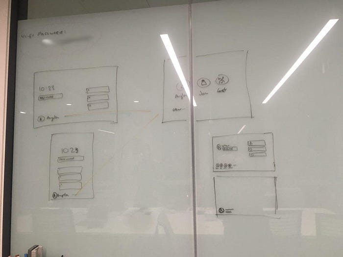
One of my favorite concepts shared was by Tobias. He mocked up using the user’s wallpaper as a stronger identifier combined with their avatar as cards in the user list, then expanding that wallpaper out to the full screen when the user is selected. I’ve reproduced the gist of it in this terrible sketch:
At the end of the day, we didn’t have a single clear path forward, but had many concepts that we want to explore further. We did have a consensus of the key goals and some converged ideas around notifications and user avatars, which was productive. I look forward to seeing these ideas more fleshed out!
Food, Sights, & Social
What would a hackfest be without a little bit of food and socializing as well? Allan led the way to several delicious food venues throughout the week including Malaysian, Vietnamese, Australian, Thai, Ethiopian, British, Spanish, Italian, and probably half a dozen others I forgot. We also spent some time in the evenings at a handful of local pubs, and met up with more members of the GNOME community at the GNOME Beers event on Wednesday night.
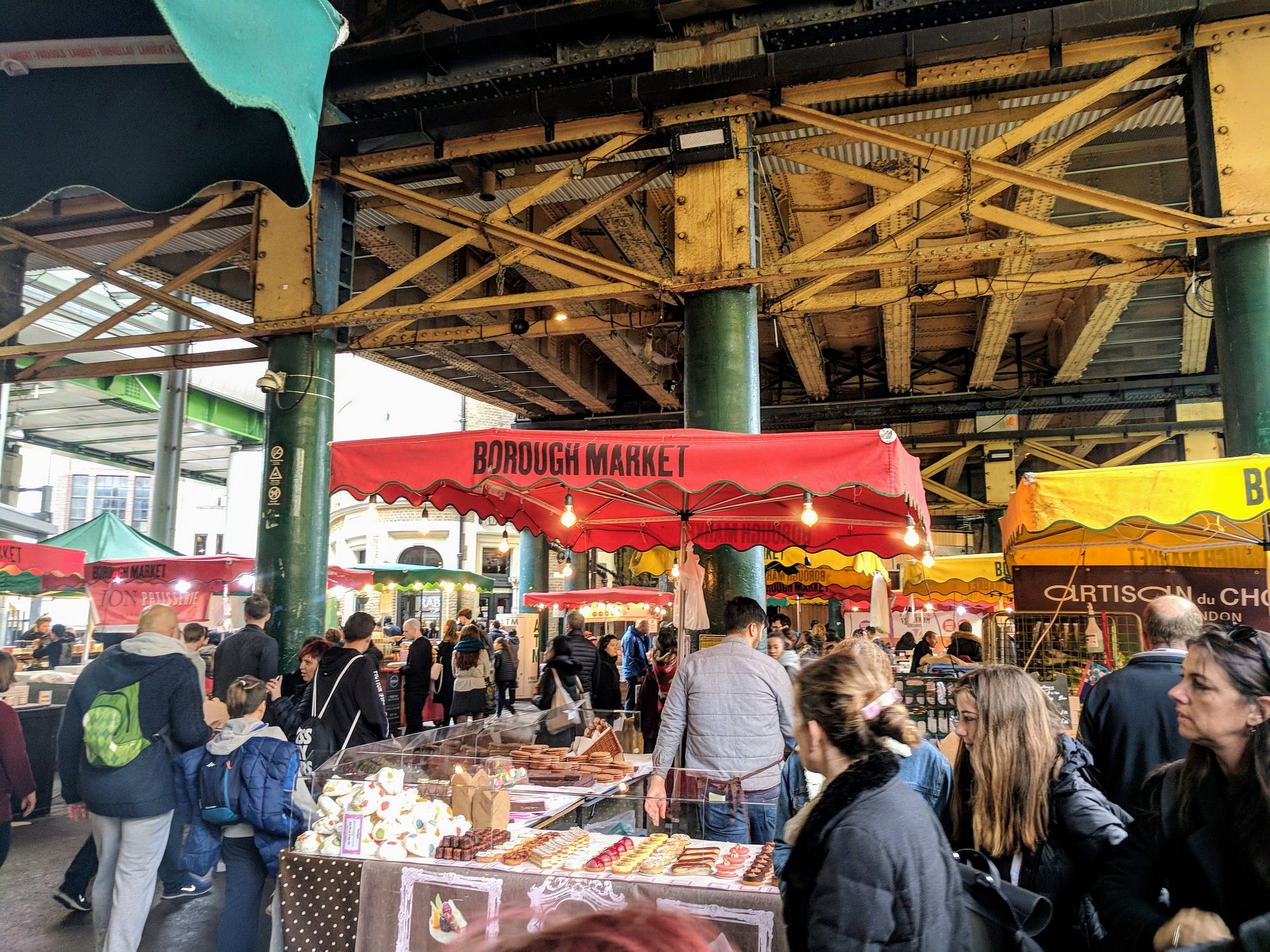
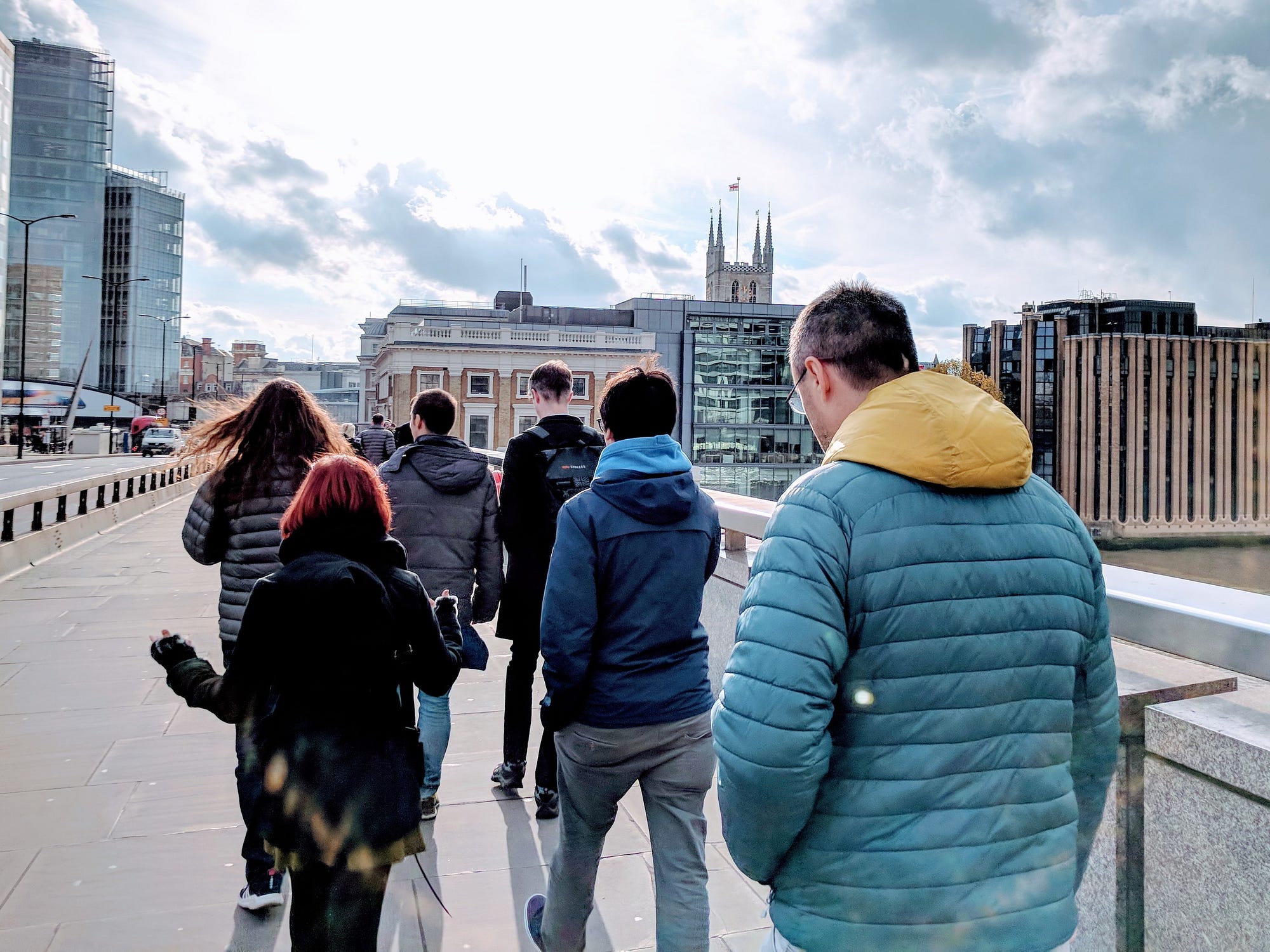
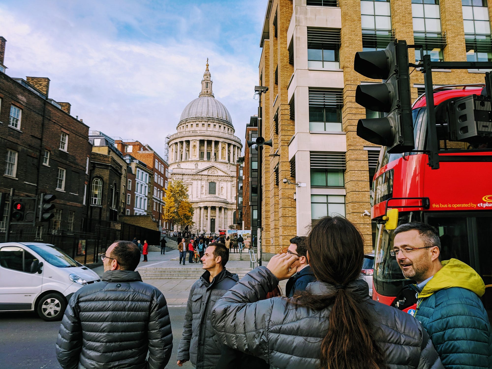

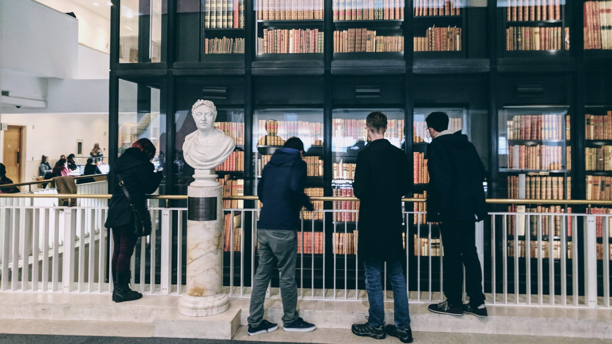
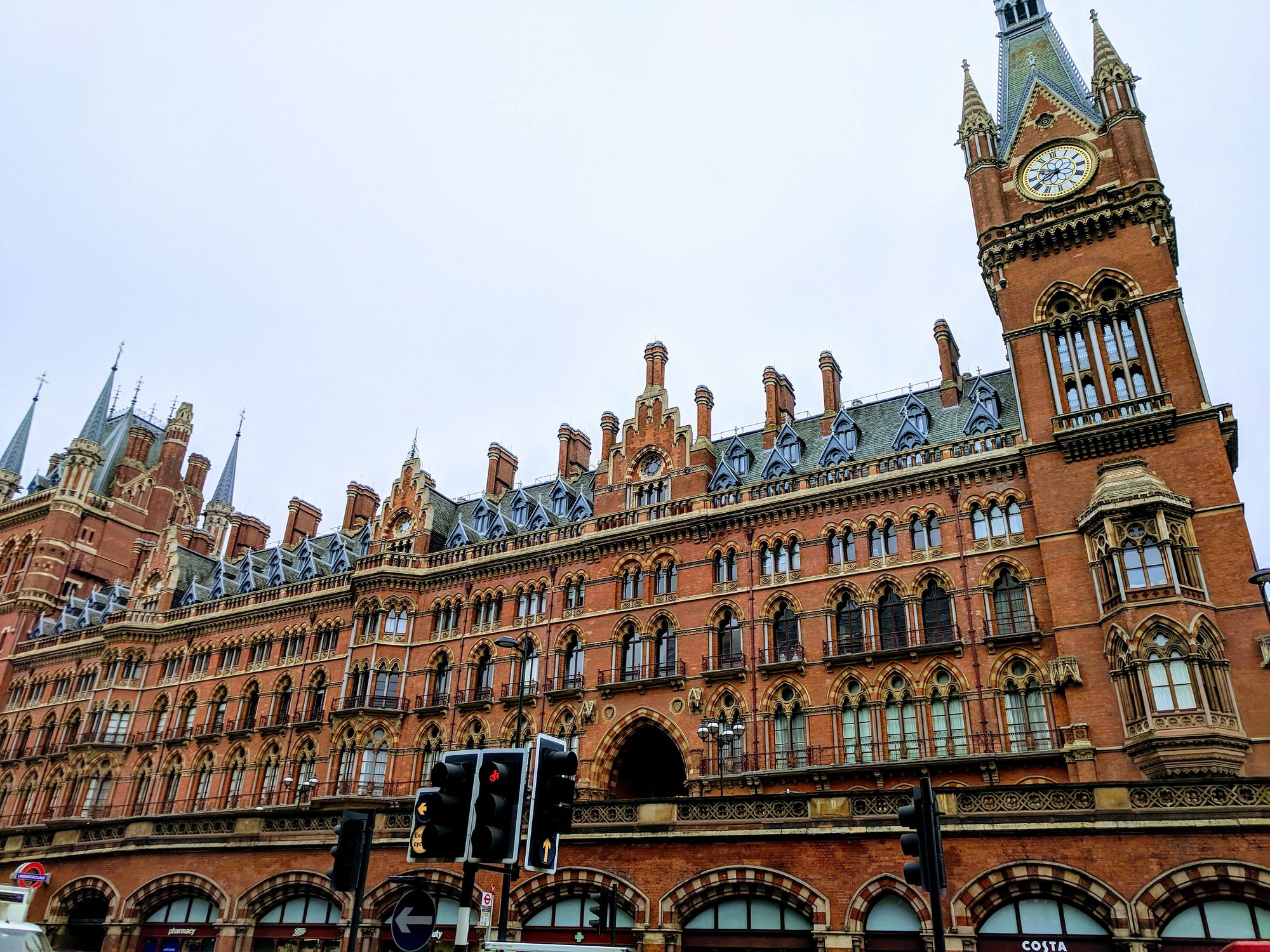
We spent one long lunch grabbing food at Borough Market, walking along the River Thames, and crossing the Millenium Bridge doing a small amount of sightseeing. After a different lunch we briefly stopped by the British Library.
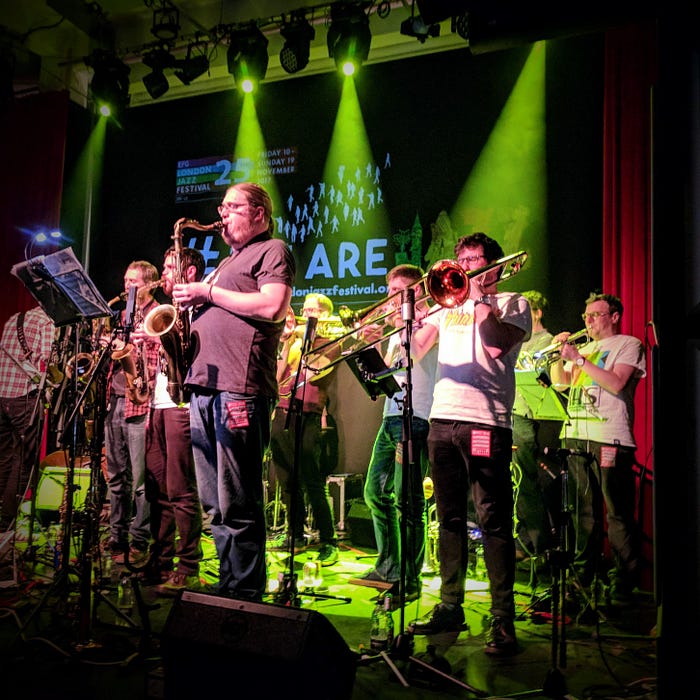
We ended the week at a big band jazz performance by Beats & Pieces as a part of London Jazz Week, and got what I’m told is a traditional British cuisine: salt beef bagels.
Summary
Overall, the event was a huge success in my eyes. We iterated through a lot of ideas, generated quite a few designs that can be refined and eventually implemented, and also just bonded as a community of designers within GNOME.
I am sure I missed some things we discussed, and I purposefully left out any higher-fidelity mockups (since these ideas are in no way set in stone). If you want to dig into things on your own, be sure to visit the hackfest wiki page for more details. Also feel free to message me on social media or via any of the methods in the footer of this page, and I will try to answer any questions.
Thanks to GNOME, Endless, and Red Hat for making this event possible, and System76 for sending me out to London on such short notice! I look forward to our continued collaboration.